

In 2016, home décor paint trends were an array of soft tones to even more intense colors. There are rich, robust colors that became very popular last year for walls in large, main rooms to small, cozy nooks or guest rooms. Some colors may seem out of your comfort zone, but paired with the right furniture pieces and tones, and you could have a bright, welcoming space to socialize in, or a warm, cozy retreat. Some of the most utilized colors in 2016 included soft shale pinks and corals, shades of deep greens, such as spinach or army green. Vibrant blues were hot colors in 2016; dark teal, slate blue and dark slate were paired with animal prints and dark wood furniture pieces.
Glitzy yellows, corn yellows and sunflower yellows were also used in bright, well-lit rooms to help add the look and feel of space and openness. Shades of purple were used in 2016, especially lavender hues. These colors on the walls coupled with espresso-colored furniture pieces, the room can envelop you and warm you up on a cold day. Keep reading to see what awesome painting trends are expected to be popular in 2017.
Painting trends for 2017
According to Behr Paints, one of the most well-known paint companies, home décor paint trends for 2017 are going to be drawn off of three main ideas: Confident, Composed, and Comfortable. The three categories will be drawn from blues and reds, greens, taupes, pinks and pastels and even yellows. Behr suggests those who are more creative or social-type people will draw from the Confident palette which include, dusky blues, lime greens and spicy reds, are eye catchers. Composed palette colors are earthy greens and taupe shades and will more often be chosen by traditionalists looking to create a contemporary look. Comfortable colors are blues, yellows and pinks. More than not, muted shades of these colors will be used by those who are new at adding color to their space or quiet, introverts who don’t care for bold décor.
Here are five awesome painting trends you may be seeing this year:
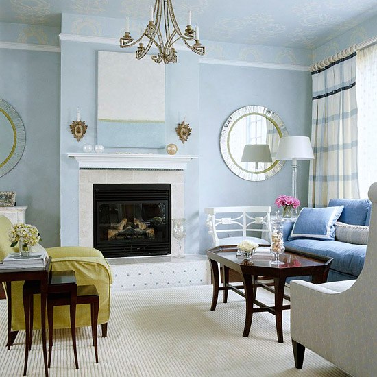
1. Dusky Blue
Most people love the ocean or at least, the thought of the ocean. It is tranquil and relaxing, and it makes us think of happy times. Dusky blue is a color that can bring that feeling into your home. Using dusky blue in a room with high ceilings really gives height to your room and adds depth to your space. The dusky blue offset with white trim, really makes white trim pop. This color works well with white or light colored furniture pieces and for an additional color burst, a small piece of furniture in a sea foam green or other color, can really make the walls stand out.
2. Blue Green
Blue green is a Confident color and will be seen in many spaces next year. Large walls or broken-up spaces, such as a kitchen/dining combo, are great spaces for blue green shades on the walls. This is a great color to use orange accents as your offset color; orange throw pillows, picture frames, even seating pieces. This combination is a perfect color for those who want to add a dramatic look to their home without being overly dramatic. Blue green is a warm and sensual color that works well in just about any room in the house.
3. Purple
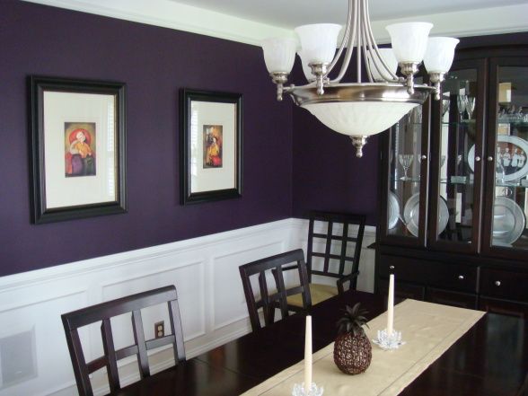
This year colors are moving about the home. Rich, dark colors aren’t only going to be used in formal dining areas but will be found on walls in other rooms too. Deep, sullen colors are making their way into bedrooms and even bathrooms this year and really showing their adaptability in all rooms. Using dark colors to create a soothing space is perfect for those who want to move away from neutral tones. For accent colors, use black golds and stainless steels to really put your room into the calming zone.
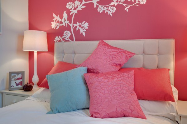
4. Pinks
Pinks are the ultimate feminine color and if you still love pink, just know that it is still a popular home décor color. Pinks are usually thought of as a color used in a bedroom to create a feminine retreat, and that is one perfect place for Rose Quartz. Rose Quartz is a rich pink that when used in a highly lit room full of windows that let in a lot of natural light, it really brings out the richness of the color. A guest bedroom, your child’s room, any room you want to take-on a rosy attitude, this color is a delight. To add to the color on the wall, add accents of different shades of the rose quartz or a deeper pink, around the room. Curtains with the shade of pink disbursed throughout the pattern, throw pillows, lamp shades, even a large, overstuffed chair. The ideas are endless to what you can do with pink, so let your imagine wander.
5. Yellow
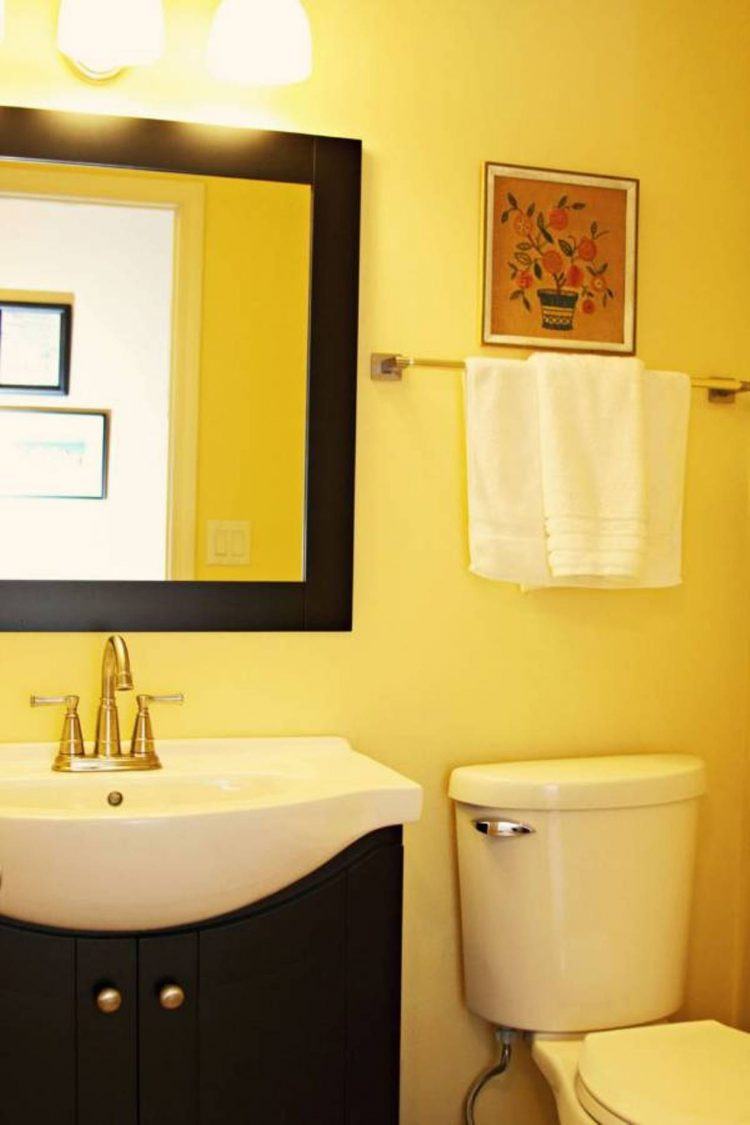
For years, yellow was thought of as a color for kitchens and a baby’s room. Today, yellow has taken a turn around the corner in homes and has migrated into many other rooms in the house. There are so many different shades of yellow to choose from. Choosing a shade that works with your room’s wood tones may seem difficult but a couple of tips are that ash blond wood tones can work with just about any shade and warm tone woods should be complimented by warm tone shades on the walls. A small guest bath can really pop when all the walls are a single color as well as a darker shade of yellow. It gives a room a finished look when all the walls are congruent in color. Accent a small bath, bathed in yellow with white accent décor, with some dark pieces sprinkled in for dramatic effect; black or red.
The colors for 2017 are going to be exciting, according to many paint and home décor experts. It is going to be exciting to see where home owners take their ideas with the new paint color favorites this year. Companies like Behr and Sherwin Williams are waiting to see which colors will be flying off the shelves this year in an effort for homeowners to give their homes, and rooms a new facelift.
Comments
Loading…