

It’s remarkable how a wardrobe can be upgraded with only subtle changes. Color, especially, plays a role in how people are seen and how they feel inside those clothes. And once you turn 60, the relationship to color is no longer about following trends. It’s more about finding tones that truly flatter your real appearance and age. Here you’ll discover 10 specific shades that create a lively and naturally radiant effect tailored to senior women.
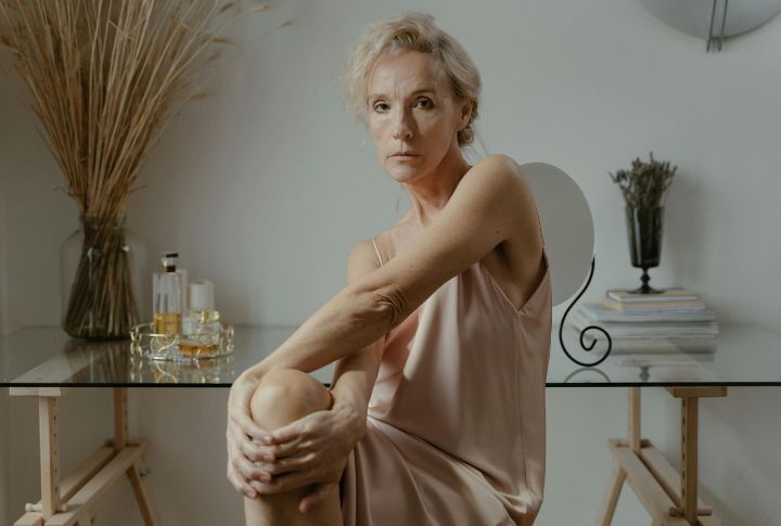
Soft Rose Pink
Soft rose pink has an understated power in a wardrobe. It complements the transition to silver or salt-and-pepper hair and offers warmth that softens the overall look. Skin appears brighter, fine lines less pronounced. Many women discover they look naturally radiant without needing additional makeup.
Warm Ivory
While black can sometimes feel harsh and white too stark, ivory strikes the balance. Its subtle warmth adapts to different skin tones and softens the overall look. Combine it with camel or navy, and you have a cornerstone pairing: chic and endlessly wearable.
Soft Blue
Colors influence first impressions, and soft blue communicates ease. It’s a shade that softens your presence and makes interactions feel more relaxed. At the same time, it enhances the skin’s glow and complements the natural elegance of gray hair beautifully.
Rich Plum
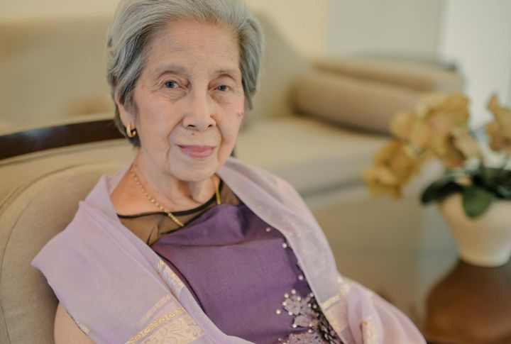
Think of rich plum as the refined upgrade to black. It delivers drama while being gentler on mature skin, particularly when you choose versions with warm undertones. The payoff: eyes in shades of green, hazel, or brown appear more vibrant.
Soft Olive Green

The natural, earthy vibe of olive green brings a grounding element to any wardrobe. Not only does it complement various skin tones with warm undertones, but it also creates calm confidence. This sophisticated neutral pairs wonderfully with creams, browns, and blush pinks.
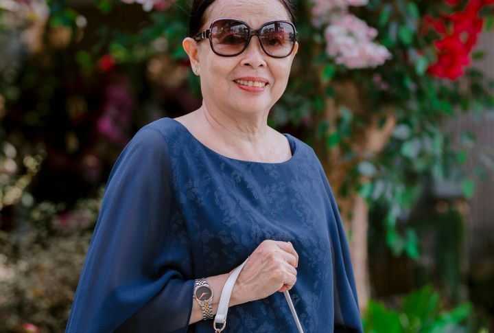
Navy
Unlike fleeting colors, navy holds steady across seasons. It works with lighter fabrics in summer and heavier textures in winter, always flattering. The shade complements aging skin by adding depth. It’s a lasting choice that adjusts gracefully as trends shift and styles change.
Warm Terracotta
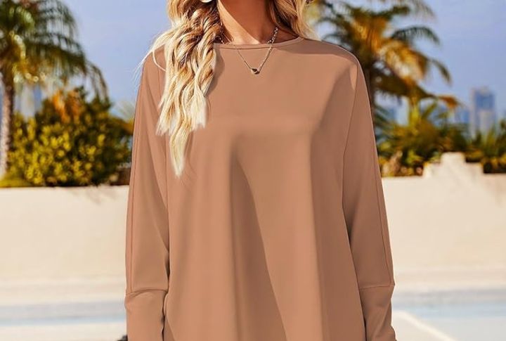
Inspired by clay baked under the sun, terracotta adds character and warmth to clothing choices. The shade gently softens and brightens the skin, never overwhelming it. For many senior women, it becomes a reliable color that provides style and a subtle connection to natural elements.
Camel
If you want one neutral that always feels chic, camel is a great option. It suits all complexions, and the shade itself conveys a sense of earthy balance. Easy to coordinate, it pairs with nearly any color to ensure your wardrobe stays versatile and stylish through changing seasons.
Taupe
This gentle neutral earned its name from the French word for mole, inspired by the animal’s fur color. Taupe combines brown and gray tones. Additionally, its adaptable nature works with many palettes, especially when matched correctly to warm or cool shades.
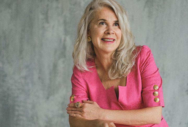
Bordeaux
Named after France’s prestigious wine region, Bordeaux carries an air of timeless refinement. The color’s association with luxury and classy vibes makes it ideal for formal attire. It also shines in everyday accessories. The deep, rich qualities also mirror those of classic burgundy.