

Who says luxury needs a label? The secret to a high-end interior often lies in the colors you least expect. No need for massive makeovers—just a smart shift in tone can transform your space. These colors (trending or not) always set the scene for a home that feels quite expensive.
Dusty Rose
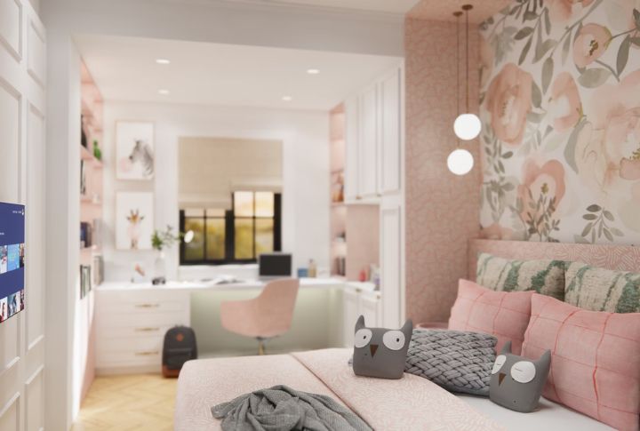
Ever seen a pink that doesn’t scream bubblegum? That’s dusty rose. Featuring muted undertones, it brings softness without feeling childish. This shade works wonders in bedrooms and powder rooms, particularly alongside cream, walnut, or even charcoal. Romantic but never tries too hard!
Charcoal Gray
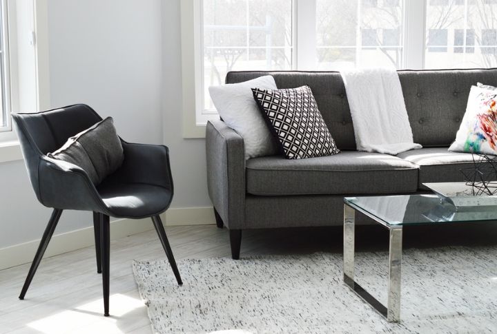
Cool tones like charcoal gray rank high in interior psychology for conveying sophistication. It absorbs just enough light to add depth while keeping a room bright. Designers often use it in minimalist or industrial settings. Even clutter takes on style when surrounded by something effortlessly refined.
Deep Navy
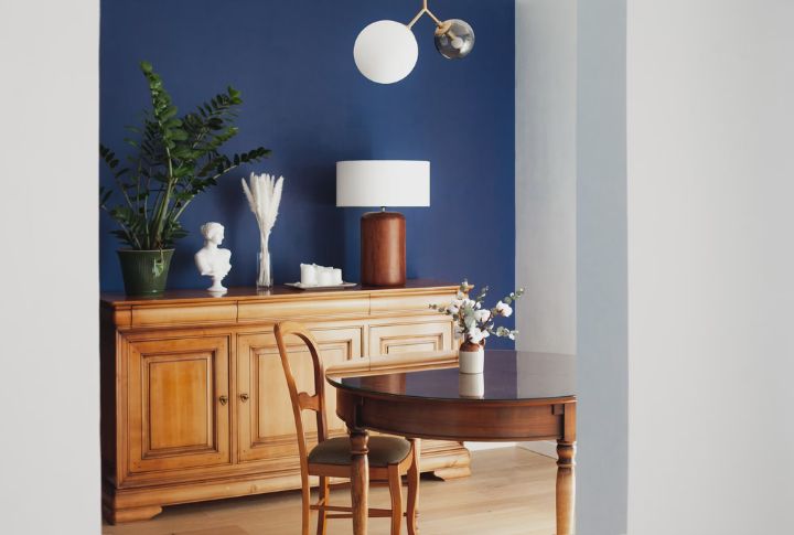
Dark doesn’t mean dreary. Deep navy brings instant drama to a space, making walls feel grounded and intentional. In dining areas or libraries, the tone evokes confidence and timelessness. Pair it with metallics or crisp whites to amplify the upscale feel without going overboard.
Forest Green
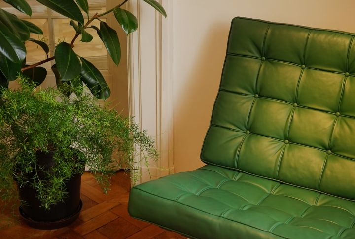
Forest green channels a depth that feels both natural and collected. Its hue draws the eye without overwhelming the surroundings. In studies or living rooms, the shade sets a steady mood with ease. Under soft lighting, it takes on a velvety character that feels enduring.
Terracotta
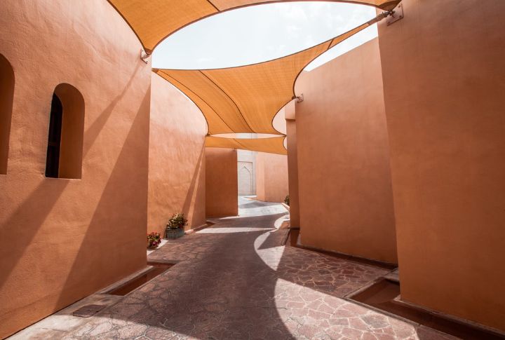
What if warmth had a color? Terracotta brings a grounded charm, instantly lifting the feel of a room. Where sunlight filters in, it glows naturally. Combined with textured materials or aged finishes, the look leans rustic without feeling dated.
Greige
Part beige, part gray—and fully transformed. Greige offers a smooth, balanced tone that adapts to both modern and traditional spaces. It creates a soft backdrop for wood accents or textured fabrics. Ideal for open floor plans, it effortlessly connects different corners of the home, creating a polished look.
Warm Taupe
Resting between mushroom and latte shades, warm taupe adds quiet elegance without demanding attention. In rooms filled with natural light, the tint shifts gently throughout the day. Its earthy look makes it a reliable choice for refined, lived-in settings.
Soft White
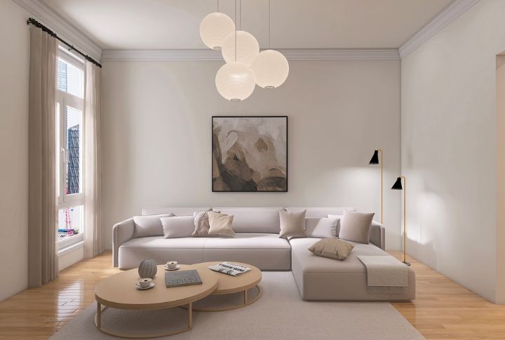
Forget sterile white. Soft white brings a gentle richness that keeps things crisp without feeling cold. Often found in sophisticated interiors, it softens sharp edges and quietly lifts a room. In living spaces or hallways, it casts an airy effect that feels intentional and composed.
Slate Blue
Slate blue forms a laid-back vibe while looking classy. This shade works beautifully in bathrooms and bedrooms, especially alongside brushed nickel or soft neutrals. It carries enough color to feel deliberate but stays calm enough to give a peaceful touch.
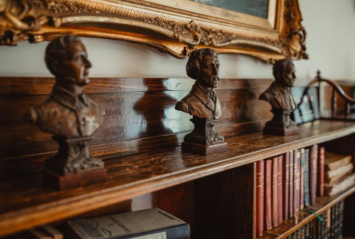
Blackened Bronze
Looking for impact without the flash? Blackened bronze offers a deep character that adds subtle drama to any space. Whether used on trim, cabinetry, or a single feature wall, it brings a definition that feels luxurious. The finish reads modern but carries a timeless sense of depth.