

The early 2000s had a distinct look that was easily recognizable from across the room. Shiny finishes, heavy furniture, and colors borrowed from coffee chains felt grown-up then. Now those things are outdated. But if you swap a few pieces, the place breathes again. You can add lighter woods, simpler shapes, and daylight that actually reaches the floor. You don’t need a full remodel. Just a handful of honest updates changes how the whole home feels.
Beige on Beige Everywhere

Beige wall, beige carpet, beige sofa—safe, but flat. Rooms disappear into one warm blur, and nothing stands out. Keep one beige anchor if it grounds the space, then add contrast. A crisp white trim, a striped cotton rug, an oak side table with a small plant. Texture matters. Even a nubby throw over the armrest breaks the fog and gives the eye a place to land.
Faux Tuscan Kitchens
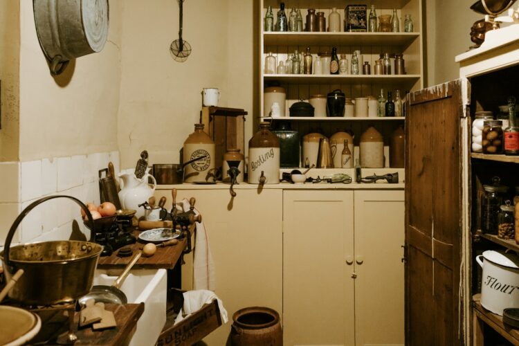
Catalogs sold the dream: dark cabinets, scrolled iron, and speckled granite that hid every crumb. In real homes, the look swallowed light. Trade busy counters for quieter tops and soften the wood tone. A pale backsplash lifts the whole wall. A single bowl of lemons on a clean counter looks more inviting than painted grape vines. Let dinner be the star, not the theme.
Wall Words and Slogans
Hallways told you to live and laugh for years. After a while, nothing felt personal—just labeled. Swap slogans for moments. A candid photo from a messy birthday. A child’s watercolor inside a simple frame. Even an empty stretch of wall helps your eye rest. Homes don’t need instructions. They need evidence that someone actually lives there, like a forgotten receipt tucked under a magnet.
One Loud Accent Wall
A cherry red wall once felt bold in a small room. It boxed everything in and fought the furniture. You can maintain contrast without shouting. Go tone on tone—clay with sand, navy with slate—or try a soft limewash that moves with the light. Add a dimmer and let the color shift at dusk. The room calms down, and conversations last longer.
Cherry Wood Overload

Glossy red-brown furniture signaled seriousness and matched everything a little too well. Over time, it made rooms feel heavy. Break it up with matte black knobs, linen shades, and a light wood side table. A natural fiber runner on the dining table instantly softens the shine. When the red stops dictating the palette, the rest of the room can finally breathe.
Giant Entertainment Centers

Those units were built for thick plasmas, stacks of DVDs, and a tangle of cables. They still eat in the living room where they survived the move. Mount the screen, use a narrow console, and hide cords in a simple box. Two baskets handle remotes and chargers. That new negative space feels like found square footage. You’ll notice the baseboards again. The room exhale is real.
Glass Block Partitions
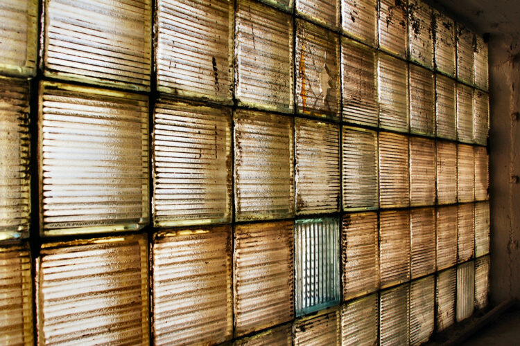
They looked futuristic in brochures and turned bathrooms into shadow boxes at night. Light fractured in, and privacy felt strange. Instead, you can paint the surrounding trim crisp and hang a plain mirror to steady the scene. When possible, swap blocks for a clear or frosted panel; morning light falls evenly on the tiles. A small fern on the sill is the quiet proof that it finally works.
Vessel Sinks
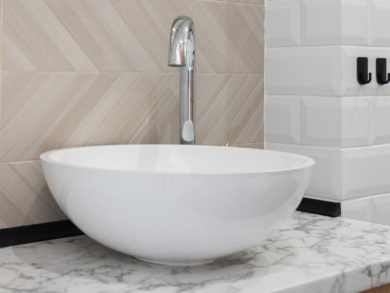
Great in photos, fussy in practice. Water arcs over the rim, toothpaste gathers at the base, and cleaning around the bowl becomes a chore. An integrated top with a simple faucet solves it. Fewer edges to wipe, fewer splashes to chase. A hand towel on a small hook finishes the update. You’ll leave the room dry and stop keeping a rag by the soap.
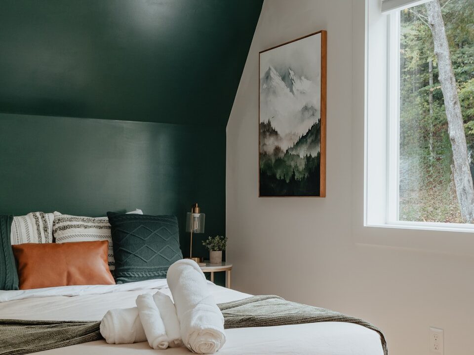
Heavy Drapes and Valances

Those thick curtains had their moment. They made rooms look proper but kept out every bit of daylight. And after a while, it felt like you were living in the shade. But if you try something lighter, like plain linen that moves when the windows open or a simple roller shade that disappears when you need the view, the whole space changes. The air feels fresher, and you may even leave the windows open longer.
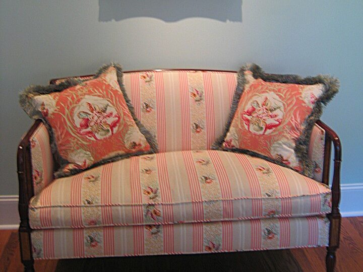
Pattern Pileups
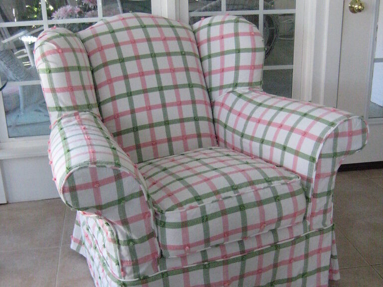
The floral sofa beside the plaid chair, alongside swirling drapes, kept the eye busy and tired. Keep one pattern you love and let the others fade into the background. A solid sofa paired with a subtle herringbone throw works well. So does a plain chair next to a striped ottoman. When a single print leads, the rest can support. You’ll feel the difference the first time you sit down to read.
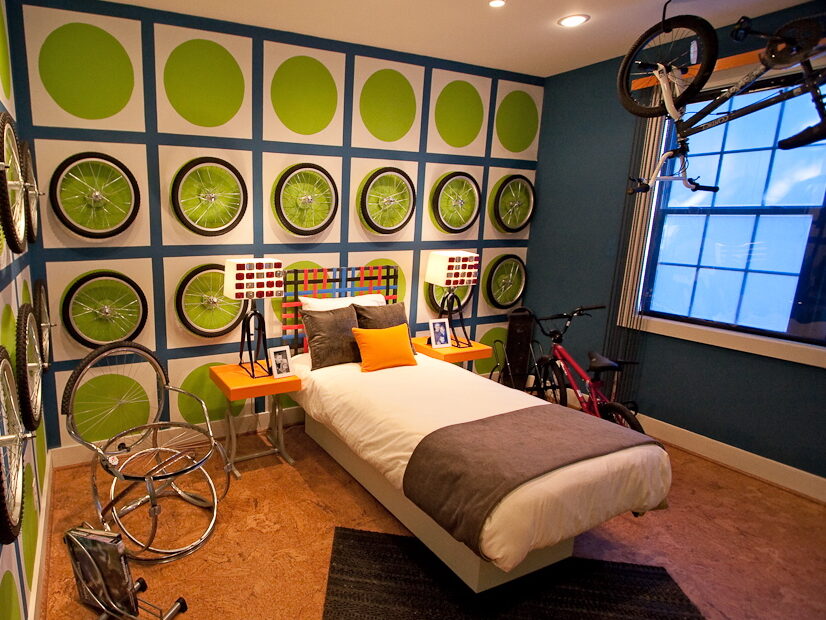
Theme Rooms
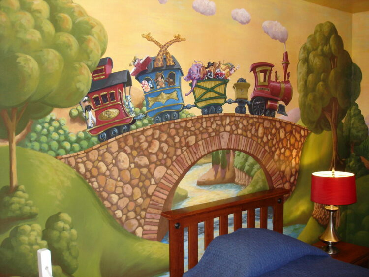
Beach bathrooms with starfish on every shelf. Paris bedrooms with tower prints on lampshades. The idea swallowed the person who lived there. Keep the feeling, not the costume. A woven basket for towels. A vintage travel poster in soft color. A small dish of shells you actually found. The space tells its own story without needing to be announced from every corner.
Popcorn Ceilings

They trapped dust and ate light along the edges. Removal is messy, but the payoff is immediate. The room gains height you didn’t know you had. If scraping must wait, paint a true flat white and add a simple flush mount. Evening shadows stop clinging to the bumps. Saturday vacuuming loses that fine snow along the baseboards. It’s calmer without the texture overhead.
Sequin and Fringe Pillows
Catalog couches wore glitter, fringe, and satin all at once. Fun for a minute, noisy forever. Choose fewer, better textures—nubby cotton. Quiet velvet. Two pillows and a folded throw set a pace you can live with. Toss the sparkly ones in a donation bag. The sofa finally looks like a place to sit, not a costume rack. The remote on the armrest is enough.
Clashing Hardware Finishes
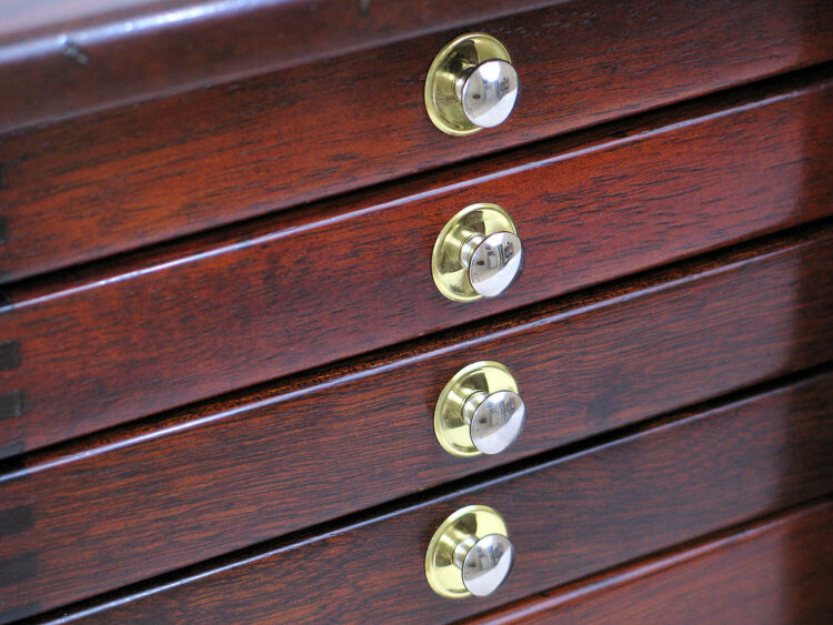
Oil-rubbed bronze was pitted against brushed nickel across faucets, pulls, and towel bars. No one won. Pick one finish and repeat it: the faucet, the hinge pins, the tiny screws on the switch plates. Consistency calms the room without calling attention to itself. The first time you wash your hands and don’t notice the hardware, you’ll know the change landed exactly right.
Perfectly Matched Bedroom Sets
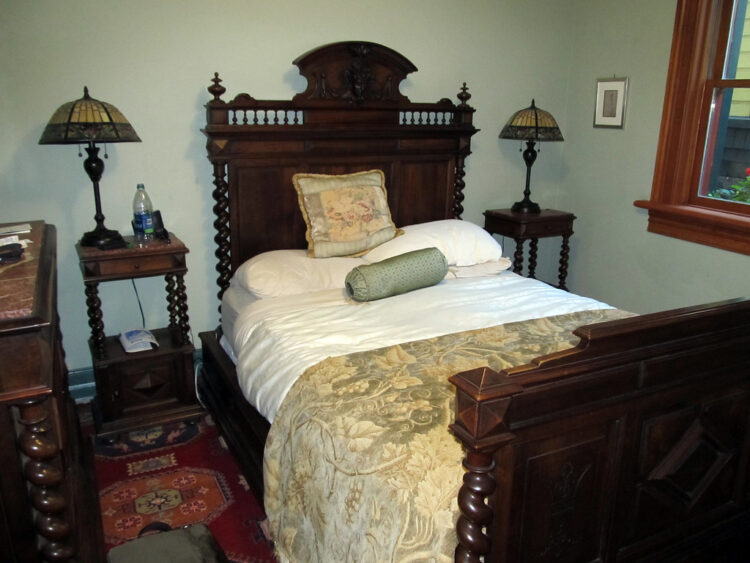
Headboard, dresser, nightstands, and mirror in the same wood and shape saved decisions and erased character. Break the set. Keep the dresser, swap the tables, and bring in a ceramic lamp with a pull chain. A small dish for earrings and a paperback stack give the surface a lived-in look. Imperfection feels better at night. It’s easier to sleep in a room with a little mix.