

The front door says more about your home than you might think. It’s the first thing guests and potential buyers notice. But some color choices can send the wrong message entirely. Luckily, others do the exact opposite, instantly boosting warmth and style. Ready to discover which hues hurt and which help your home’s appeal? Let’s start with five colors that don’t open the right doors.
Neon Green
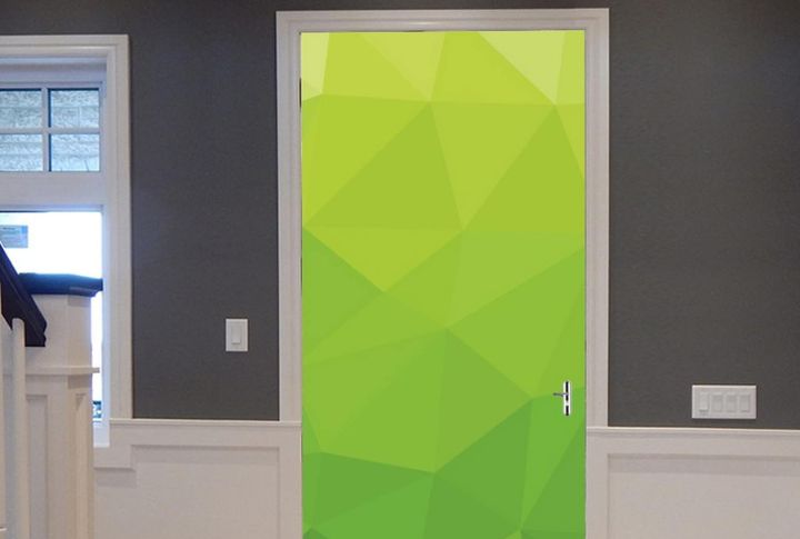
Here’s one color that looks fun until it isn’t. Neon green fades fast in sunlight, leaving behind blotchy, uneven patches that ruin the look. Plus, it rarely complements traditional homes or natural surroundings, so that bold statement might end up sticking out for all the wrong reasons.
Flat Black
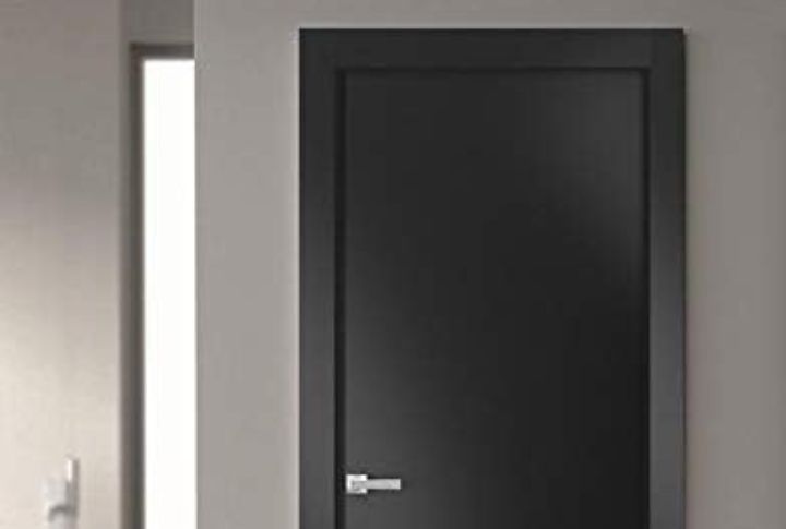
A flat black door seems effortlessly chic (and it can be), but it’s a high-maintenance choice. Every smudge and fingerprint stands out, and the dark surface traps heat on sunny days. Without good natural light, it can also make your entryway feel more gloomy than dramatic.
Pepto Pink
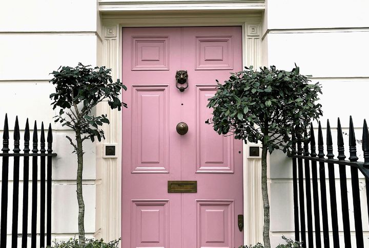
Sure, Pepto pink feels playful and unique, yet it’s a tough one to pull off. The color’s bright, candy-like tone often clashes with classic exteriors and can come off as overly sweet or juvenile. With a Pepto Pink door, your home might look more quirky than charming.
Highlighter Yellow
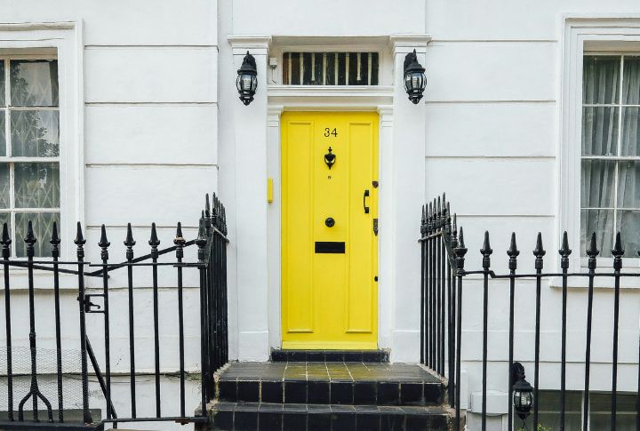
You’ll definitely get attention with a highlighter-yellow door, just maybe not the kind you want. The glare can overwhelm the home’s design, especially under direct sunlight. Moreover, it tends to throw off a subtle color scheme instead of brightening it up.
Rust Orange
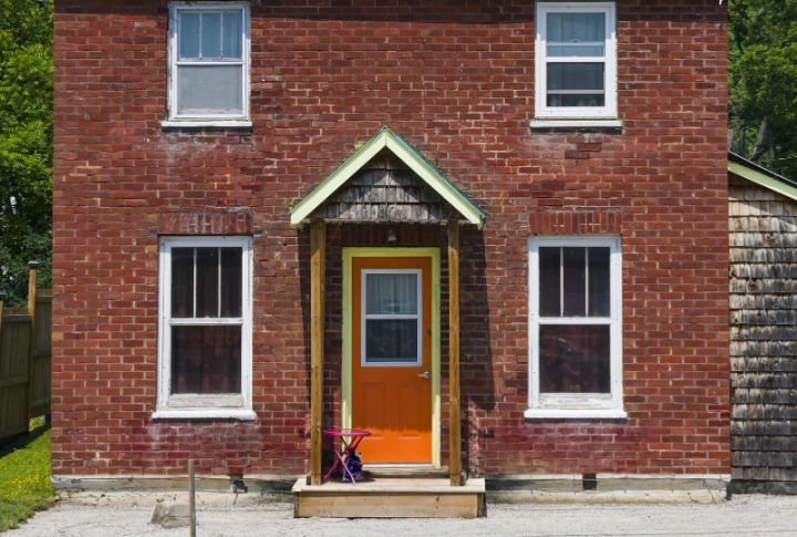
Although rust orange brings plenty of personality, it’s easy to overdo. The warm tone can clash with many siding colors and dominate the space instead of complementing it. If you love the shade, balance it with earthy textures like wood or stone to make it work.
Now, let’s look at five front door colors that can make your home feel more inviting.
Classic Navy
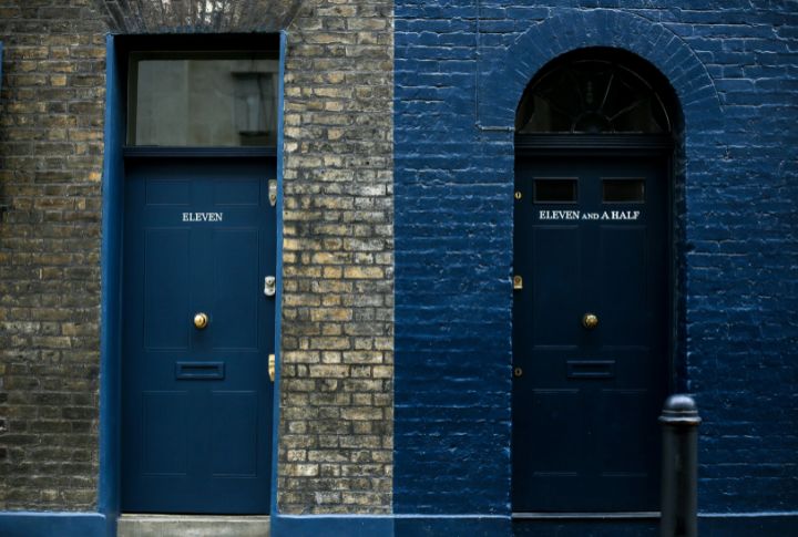
You can’t go wrong with classic navy; it’s timeless for a reason. This deep, elegant blue works beautifully with nearly any home style, from coastal cottages to modern builds. It adds contrast without chaos and gives your entryway that calm, confident energy every home deserves.
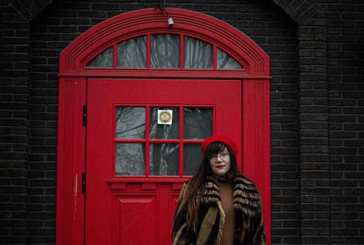
Deep Red
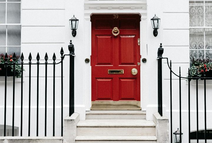
A deep red front door instantly commands attention while still feeling warm and inviting. It’s rich and steeped in tradition: it symbolizes prosperity and welcome in many cultures. Pair the deep red door with a white or neutral exterior, and you’ve got a look that’s striking yet classic.
Charcoal Gray
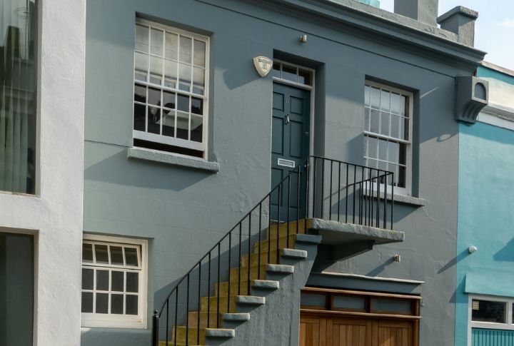
If you want an entrance that feels fresh without looking trendy, charcoal gray is the answer. This color pairs well with light siding, adding tone and polish without weighing down your home’s look. You’ll end up with something sleek but surprisingly warm—perfect for that welcoming first impression.
Forest Green
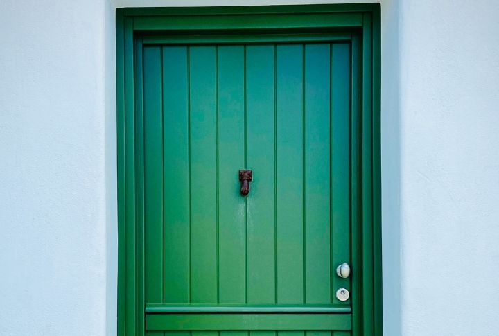
Forest green has quietly become a design favorite again, and for good reason. It’s natural and pairs effortlessly with materials like brick, wood, and stone. The color brings depth and balance to your home’s exterior, creating an entry that feels fresh but still grounded.
Warm Taupe
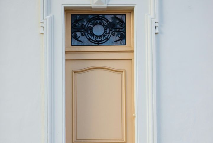
Warm taupe shade is neutral, but it looks cozy and hits the sweet spot. Its soft, earthy tone flatters nearly any siding color and makes your home instantly feel more inviting. Subtle and stylish, warm taupe is the kind of choice that never goes out of style.