
The front door might seem like just another detail, but it often sets the mood for the whole house. That’s why home expert Mike Holmes, known for his no-nonsense approach to building and renovating, pays close attention to it. The right color can shift a space from plain to polished in seconds. Coming up next, you’ll see the door colors he recommends for creating a sleek, stylish entrance.
Matte Black
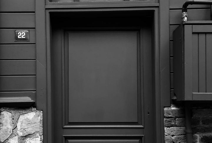
Mike Holmes recommends matte black if you want your front door to look sleek and sophisticated. It works with almost any home style, from modern to traditional. You can pair it with bright accents for contrast, though you may find it needs cleaning more often than glossier finishes.
Deep Charcoal Gray
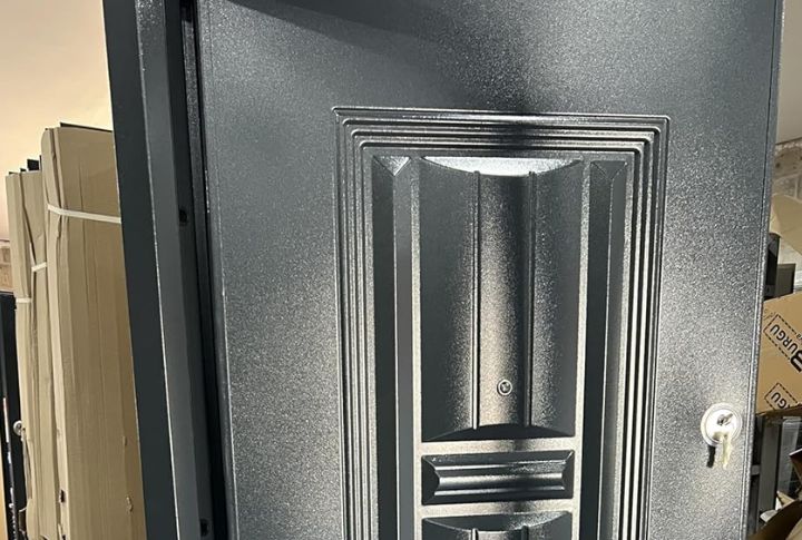
In case you want a color that feels elegant but versatile, the builder suggests deep charcoal gray. It blends well with most trim colors and architectural styles. Just avoid using it on a white house, as Holmes points out that black or navy creates better contrast in that case.
Navy Blue
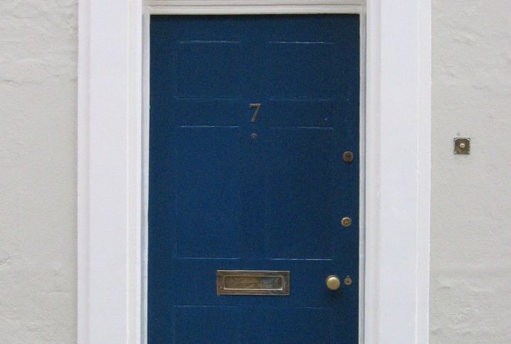
Looking for something refined but not too heavy? Holmes recommends very dark navy blue. It softens the boldness of black while keeping a polished look. Navy works especially well on white houses, and its cooler tone adapts nicely to different styles of homes.
Forest Green
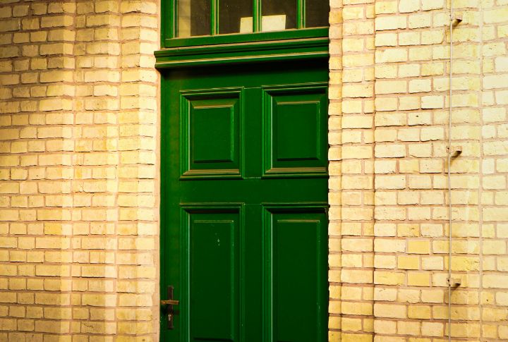
Forest green is one of Holmes’ go-to shades if you want sophistication without being flashy. It creates a grounded look that pairs perfectly with homes in cooler tones. This color also blends beautifully with the surrounding greenery, which makes your entrance feel connected to the scenery.
Burgundy Wine Red
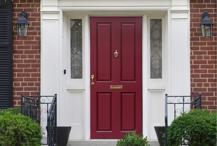
The expert also recommends rich, muted shades like burgundy wine red. It offers warmth and class without overpowering your entrance. Pairing it with dark or matte hardware makes the overall look feel cohesive and understated, adding a luxurious feel to your home.
Slate Blue-Gray
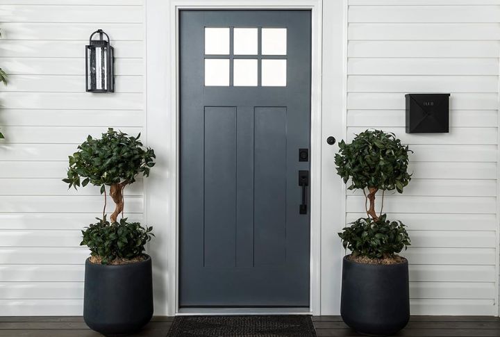
Unlike bolder shades that can dominate a facade, slate blue-gray offers a softer sophistication. Holmes sees it as a versatile color that works across various home designs. When paired with sleek hardware and cooler trims, the result is an entrance with real architectural presence.
Espresso Brown
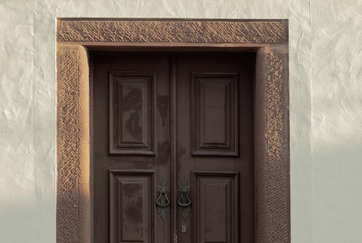
Holmes values espresso brown for its combination of warmth and sophistication. Its richness complements brick exteriors while remaining versatile enough for other styles. When matched with black hardware, the color takes on a polished character that improves the overall entrance without leaning too dark.
Anthracite With Subtle Blue Undertone
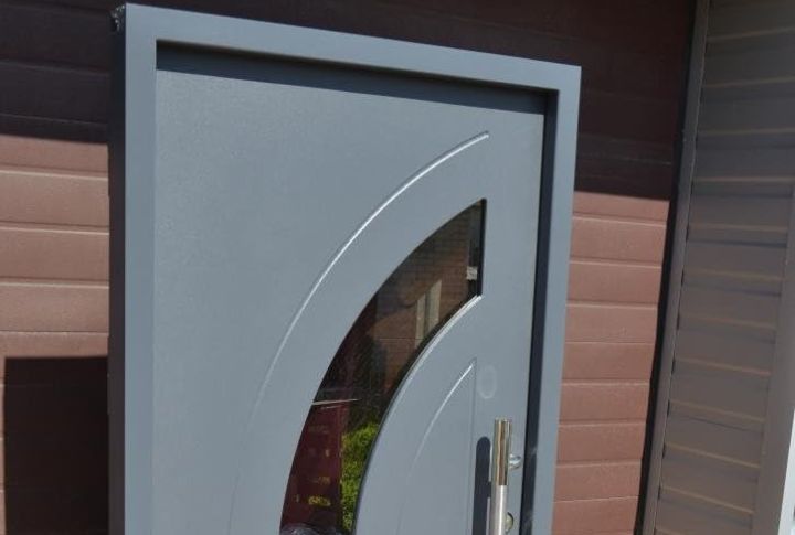
Some dark shades can feel flat, but anthracite gray with blue undertones avoids that. Holmes highlights this option for its balance of impact and sophistication. Its industrial roots make it bold, while the subtle blue shift adds refinement, particularly on modern facades.
Blackened Teal
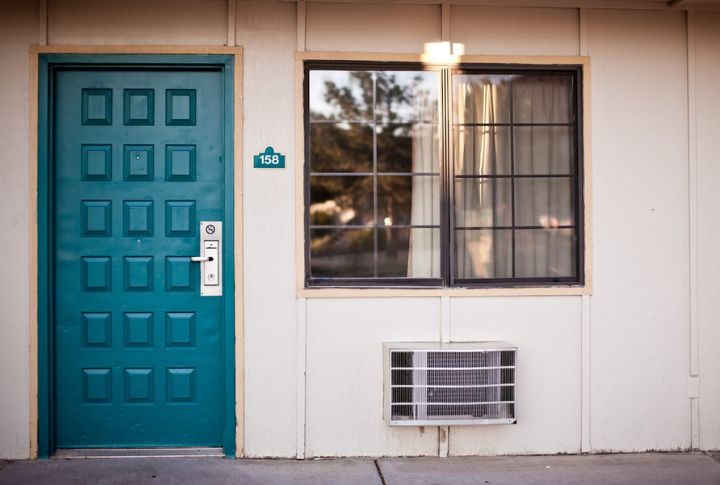
If you’d like something a little different, it’s suggested to use blackened teal. This deep blue-green color brings sophistication with a hint of drama. It looks especially classy when paired with cool-toned planters or modern hardware, giving your entrance a unique look.
Oxidized Copper Tone
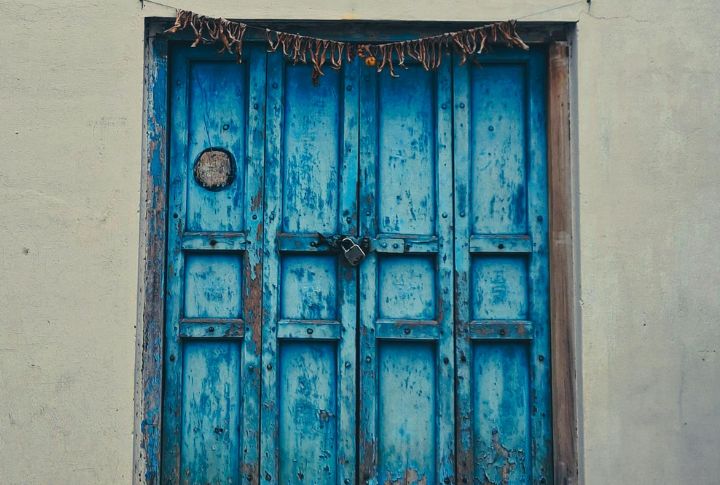
While standard dark front door colors offer classic sophistication, oxidized copper tones upgrade this high-end look by introducing subtle metallic warmth and vintage-inspired depth. The darkened copper finish proves especially versatile with traditional architecture and brick exteriors, delivering the sophisticated entrance impact that Holmes promotes.

