

Walls can set the mood before a single word is spoken. Color choices like misty lilac and crimson alter how a space feels by shifting its emotional tone and energy. Here, you can discover twenty soul-shifting hues crafted to transform your space and perhaps even your state of mind.
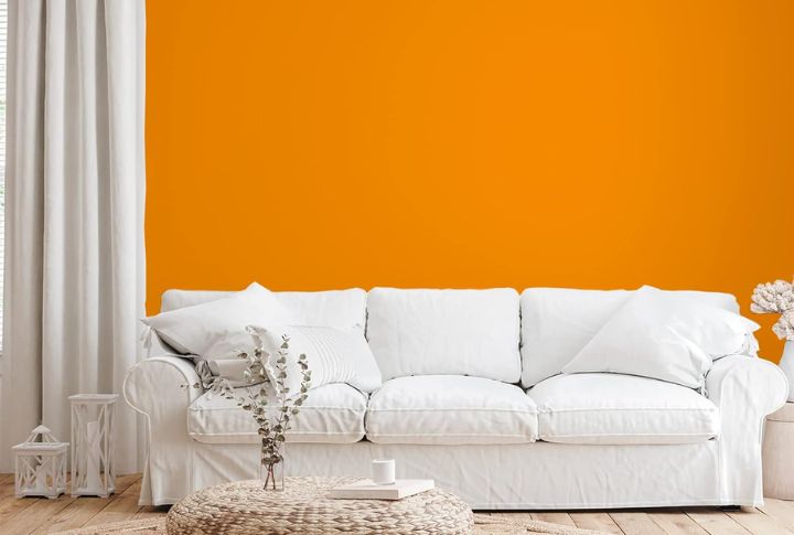
Crimson Red
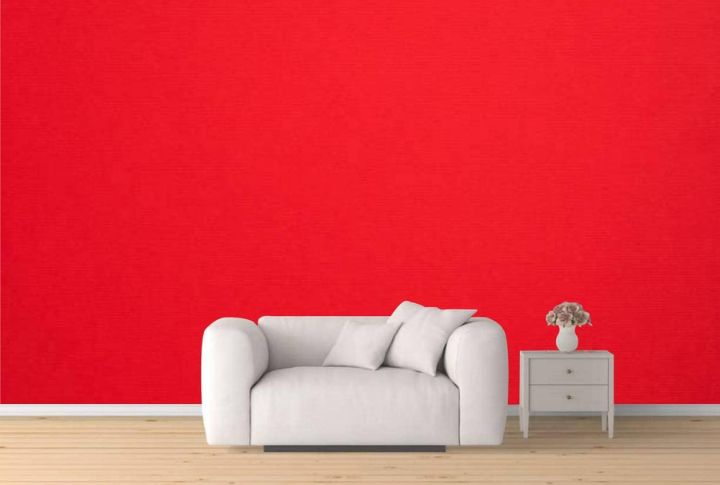
Wrap your walls in crimson red to ignite energy and bold conversation. This bright color can raise your heart rate and boost energy which makes it a good choice for entryways or dining rooms. In the world of paint psychology, red is often associated with a tendency toward risk-taking behavior.
Shades of Blue
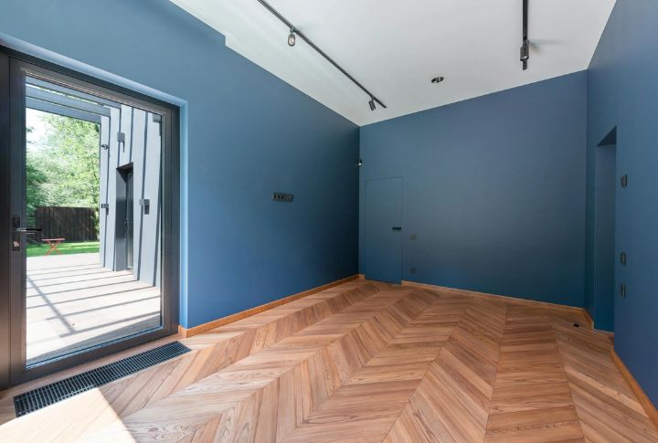
Blue calms the nervous system and helps lower blood pressure and stress. Think of a cloudless sky: it subconsciously signals safety and serenity. Soft sky blues and muted blue-grays work especially well in bedrooms and bathrooms, where a peaceful atmosphere matters most.
Bright Yellow
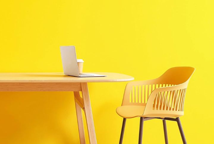
Bright yellow channels the energy of sunlight, instantly lifting spirits and creating a cheerful atmosphere. Designed with kitchens and playrooms in mind, it feels like optimism in everyday spaces. Its glow lingers gently and warms the room in a subtle way that never feels too bold or overpowering.
Olive Green
Earthy and strong, olive green anchors a space with natural depth and stability. It brings maturity and focus, which makes it a smart addition to studies or reading rooms. This shade evokes deep-rooted calm and offers stability where reflection and serious thought quietly thrive.
Dreamy Lavender
Lavender’s gentle mix of red and blue offers a balance that both soothes and sparks inspiration. Commonly found in creative spaces or sleep retreats, it calms the senses without fading away. Its subtle and uplifting tone promotes relaxation while encouraging imagination and creative thought.
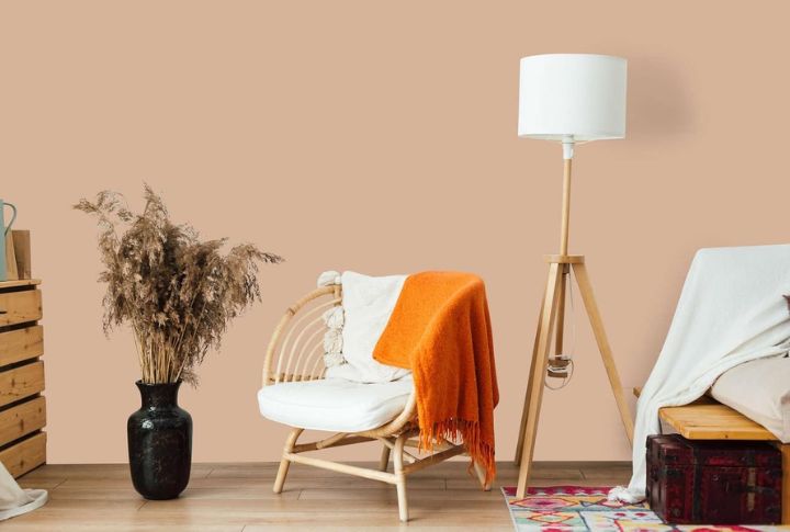
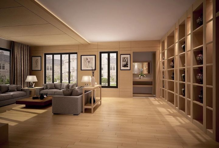
Soft Beige
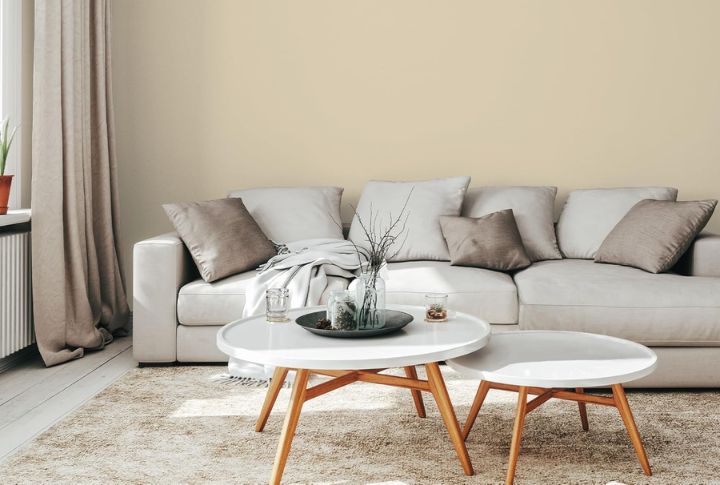
Skip the harsh whites and choose gentle beiges warmed by earthy undertones. These shades create a cozy, grounded atmosphere that brings stability to any space. Often used in rentals or open layouts, they provide a soft, neutral backdrop that feels inviting and naturally welcoming.
Dramatic Purple
Deep purples like plum or eggplant add richness and depth. This color evokes quiet luxury and thoughtfulness, which makes it a natural choice for bedrooms and libraries. Once tied to royalty, it shapes a moody, intimate space without being loud—just calm, confident, and full of character.
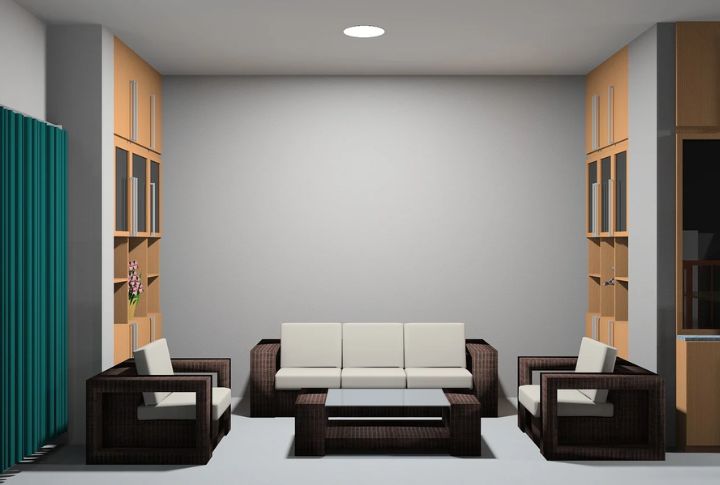
Pristine White
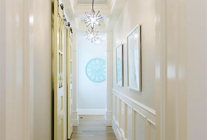
Begin with white walls that fully reflect natural light. This isn’t emptiness but a deliberate choice that brings clarity and calm, perfect for minimalist kitchens and serene hallways. The soft color creates a sense of calm that makes the space feel fresh and serene right from the start.
Blushing Pink
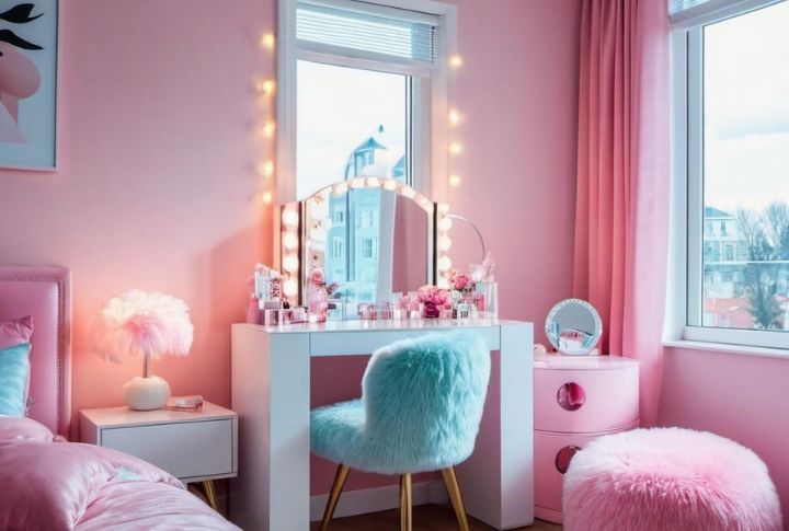
Pink goes beyond nurseries. Soft blush tones give a gentle, optimistic vibe to bedrooms, dressing areas, and bathrooms. This color shows nurturing qualities and gradually brings calm and warmth into a space, making it soothing and balanced without becoming too intense.
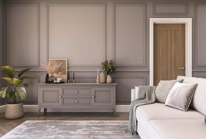
Charcoal Gray
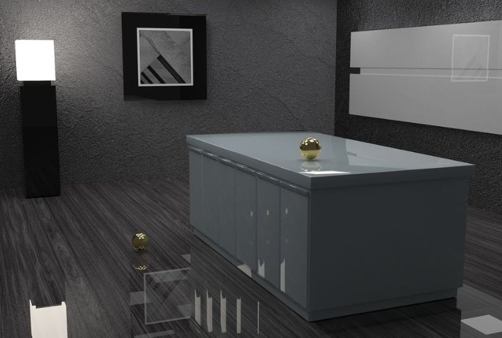
Charcoal gray adds intimacy and gravitas. In addition, deep gray is a designer favorite for creating cozy dens and inviting dining spaces. A matte finish adds elegance and not gloom, like a tailored suit for your wall—sharp, and undeniably stylish.
Golden Hue
Golden tones feel sun-kissed yet grounded, cheerful but not loud. These tones create a lasting sense of warmth to living rooms and cozy kitchens. This hue speaks to comfort, glowing gently like afternoon light on old wood or a favorite mug.
Light Gray
Cool light gray, brushed with the faintest blue, settles into a room like early morning mist. Airy and calm, it soothes modern bathrooms and mellow lounges, creating space that feels open yet intimate—never demanding, always present.
Earthy Terracotta
Terracotta brings a calm and warm vibe inspired by the desert. It works well with plants, which add character to kitchens and cozy nooks. This earthy tone combines casualness with style and enhances the space with comfort and natural beauty.
Misty Lilac
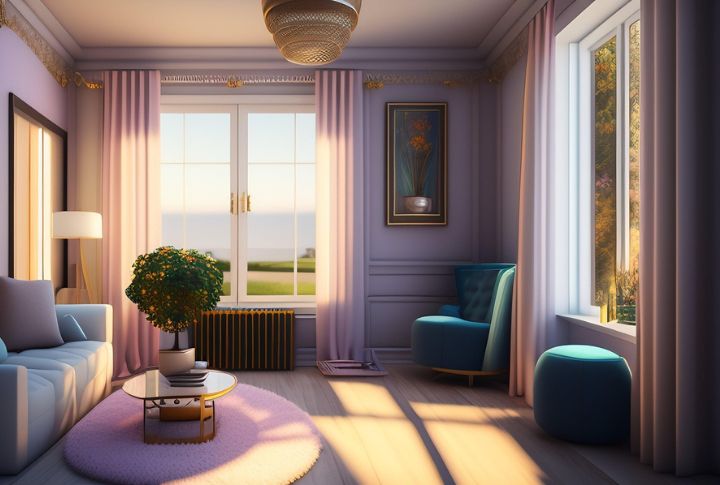
Misty lilac leans toward gray, whispering calm and restraint. With its soft nature, it enhances the peaceful atmosphere of minimal bedrooms and reflective corners. Pair it with pale wood and creams to build a serene, modern escape. It’s a quieter, more sophisticated version of lavender.
Vintage Teal
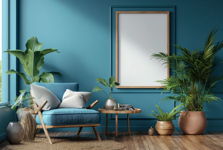
Deep teal brings a grounded look without feeling heavy. The energy of navy blue and green makes it a great choice for accent walls or bold offices. This color strikes a balance between elegance and liveliness, which makes it both stylish and full of character.
Rusty Orange
There’s a timeworn richness in rust tones—like aged brick or old book covers. They wrap a room in warmth, turning dining spaces and libraries into places that feel storied and soulful. Paired with leather or warm textures, they whisper boldness without losing comfort.
Soft Green
This leafy hue is lighthearted and clean, ideal for small spaces that need a pick-me-up. Soft green brings spring indoors with a vibe that’s refreshing and optimistic. It’s not bold like olive or muted like sage; it simply wakes a tired room with grace.
Smoky Taupe
Warm taupe adds subtle depth without drawing too much attention. It works wonderfully in hallways and other in-between areas. The color offers a smooth transition between bolder shades while maintaining a neutral tone and making it easy to style with various decor choices.
Apricot Orange

Not quite pastel, not too bold—just a perfect, peachy glow. These hues turn ordinary walls into happy spaces. A breakfast nook, a kid’s corner, a sketchpad room—all feel warmer and more alive under a splash of sherbet light.
Sage Green
Sage blends stillness with subtle depth. It’s a muted green well-suited to yoga corners or calm bedrooms. More mature than mint and softer than olive, it balances the soul of green with gray’s steadiness. This color doesn’t just soothe; it creates balance and centers the room.